|
CiA
#60 - score: 6.5 out of 10
Mongi:
In the last couple of months CiA have really had an upswing
and now close to being one of the big groups again after
their "revival" (hirez wise).
Blue Devil is really going
for other styles and themes other than "Isle of Illusions"
now. While the composition of the photomanips aren't bad,
I can imagine they would be a lot better if they were sharper
and had better image quality.
Digital Interface have his
classical rendered surreal pics. They are overall pretty
good, but if everything were a bit more realistic it would
create a much more complete feeling. For example better
textures and not so "bumpy" models.
Dragon have a very good sense
of design and layout, but the work don't give much "artistically".
They're more suitable for advertisements and such. Now this
doesn't mean it's bad at all, it's just different from most
of CiA's other work.
Firefromheaven's work isn't
as good as it use to be. They're messier and look more like
random patches of colors than complex manipulating.
Ghostface have been improving
all the time, and is becoming really good. I've followed
his work since he came to the scene, and this is his best
to date. Especially gf_psy.jpg shows a sense of composing
and trying new styles.
Incognito's work is similar
to the HRg pics, but not as good. These aren't exactly the
same style and look more unstructured, which ruins the overall
picture (if Incognito was aiming for the same style).
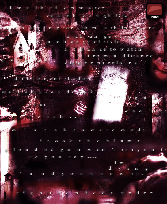
Ikarus have been cramming out
photomanips like crazy. Most of them are completely different
to his usual style and it's a welcome change. These have
more substance and you can actually see what the pictures
are, almost. The usage of different contrasting colors is
also a new perspective on his style. As you may know, I'm
against photomanips where the used photos are stolen, i.e.
not free stock photos or your own photos, but probably copyright
material. Now there's one pic that has a lot of kinky stuff,
and I doubt it's free material or that Ikarus have taken
those photos. Otherwise they're pretty good photomanips.
Lk's pic is kind of interesting.
Not special in anyway, but nice to look at. Napalm's frog
is quite realistic, with great modeling and textures. Pike
has a grossly proportioned girl as usual. As I've said before,
the outlines are pretty mediocre but the coloring is quite
smooth. Subsonic's pics are also very nice to look at, but
doesn't really boggle my mind.
Lastly, I don't know if Agent_42's
ADF should count as hirez, but it sure has the same quality
as a gif. It's the most advanced ADF I have ever seen, and
it must've taken _very_ long time to complete. Making all
those chars, and making them fit together as well is very
time consuming. It's like drawing ansi but at a higher resolution.
Just a comment on the packing.
While better than last month (could it get any worse?),
there are still some annoying details. The files aren't
packaged in alphabetical order, or any order at all as I
can see. And does the info and memberlist really need to
be in every disk? Minor details, but still a bit annoying.
score: 6.5
Root88:
Digital Interface's DI_99.jpg was one that I enjoyed. This
render has an enormous amount of details in it, and the
textures were well done. In fact there was so much detail
we could have missed that he gave us a close up view of
some of the models in another image in Di_cia.jpg Even though
some of the models were reused, both images work well as
individual pieces. The only thing I might change is the
sky in DI_cia.jpg, its not bad, but not to my taste. DIs
keeping it surreal up in the field, aight.
Most but not all of the
photomanips didnt hold my interest whatsoever. Most of
them looked like the artists took a photo, converted to
gray scale, then to RGB and did an image>adjust>variations
in photoshop (or something that accomplished the exact same
thing). Then once in a while the artist would add a filter
or another layer, it didnt seem like any ideas were trying
to be expressed.
My previous statement
definitely does not apply to GhostFaces gf_flwr.jpg photomamip.
In fact if GF didnt inform us that it was, I probably would
of thought it was something that he had created from scratch
in painter. I feel that a photmanip shouldnt merely be
altering a photograph just so it looks different, the photograph
should merely be a canvas for the artist to place his work
on. GhostFace accomplished this.
Incognitos abstract
images were done well, but were too contemporary and bland
to hold my interest.
Napalm's render of a
frog was the closest thing to a photorealistic image I have
ever seen in a CIA pack. If I saw this image somewhere other
than a groups art pack, I may have just passed over it,
thinking that it was a photograph. A good job modeling complimented
by excellent textures makes this an outstanding render.
Maybe if the leaves were rendered instead of just a photograph,
my jaw would have dropped a bit more, but most of us dont
have the hardware to handle a task like that.
Pikes drawings are pretty
good, but the fractally background in Pk_blup.jpg has got
to go. I thought fractals went out in the 80s? PK_girl.jpg
got me in trouble at work, so I didnt like that one at
all. :P
Ss_space.jpg 3d rendered
spheres. I dont think I have to say anything else about
this one to get my point across.
score: 6

|